It might be said that luxury trades on je ne sais quoi. There is the IYKYK of product drops, as well as quiet luxury’s minimal, or absent, branding. Yet design has a way of creating something recognisable as luxury through brand, laying down the ineffable in pixel and paint.
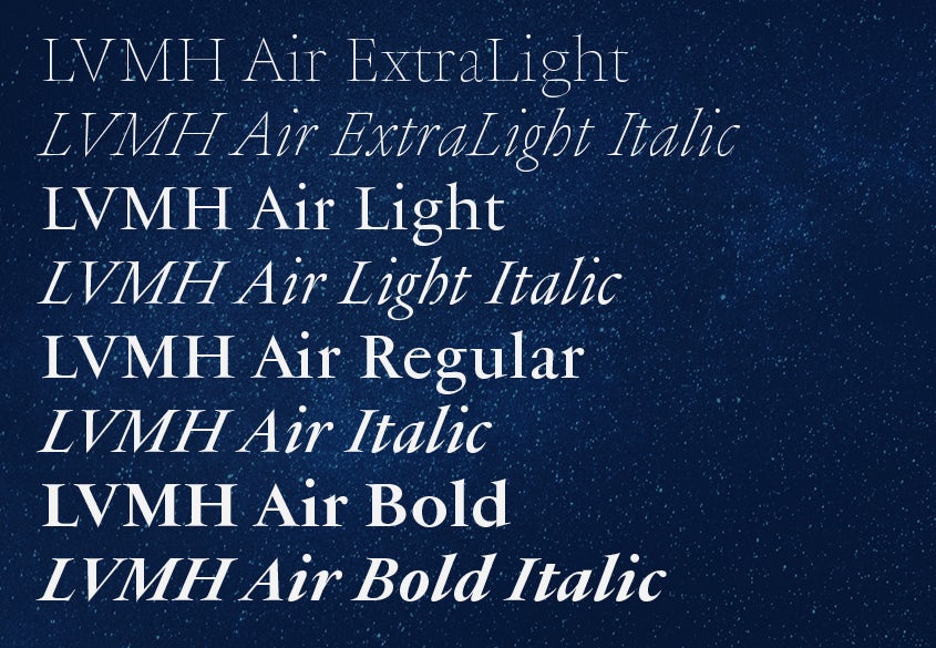
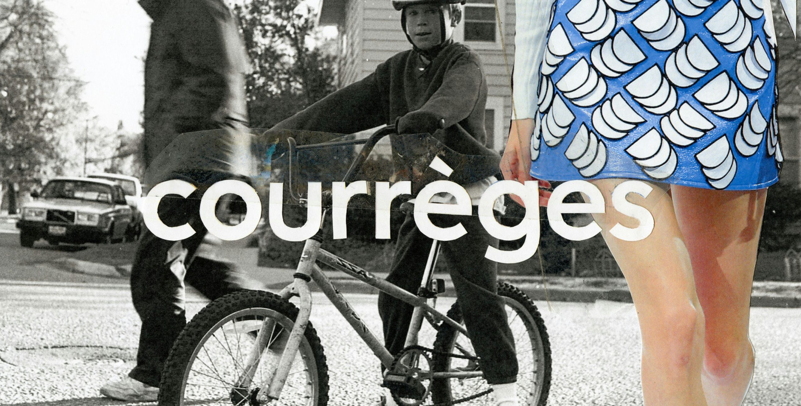
Paris- and Shanghai-based Production Type is a digital type design agency and foundry used to taking on such a challenge, with clients including Christian Dior Couture, Courrèges, Marine Serre, and perfumier Ormaie. There are different outcomes of each project: a “plain and pointy”, Germanic-influenced sans serif for Courrèges; a slightly retro, spreading all caps for Ormaie; and a full range of ultra light to black sans and sans serif cuts for LVMH – a variety to put the binary sans vs sans serif debate to bed, perhaps.
But while never relying on rules that might constitute a “typeface 101”, says Jean-Baptiste Levée, founder and president of Production Type, a job for LVMH put that je ne sais quoi to the test. Although the largest luxury conglomerate in the world, with 75 brands that run the gamut of luxury – fashion and leather goods, watches and jewellery, cosmetics and perfume, wines and spirits, retail and hospitality – it had always been “faceless”. “We are talking about a luxury player that does not sell anything, yet still needs to sweat luxury through all the pores of its surface,” he says.


Leave a comment